Replicating Propbulica’s COMPAS Audit in TD STEM Academy 2021
Why COMPAS?
Propublica started the COMPAS Debate with the article Machine Bias. With their article, they also released details of their methodology and their data and code. This presents a real data set that can be used for research on how data is used in a criminal justice setting without researchers having to perform their own requests for information, so it has been used and reused a lot of times.
First, we need to import some common libraries,
import numpy as np
import pandas as pd
import scipy
import matplotlib.pyplot as plt
import seaborn as sns
import itertools
from sklearn.metrics import roc_curve
import warnings
warnings.filterwarnings('ignore')
Propublica COMPAS Data
The dataset consists of COMPAS scores assigned to defendants over two years 2013-2014 in Broward County, Florida, it was released by Propublica in a GitHub Repository. These scores are determined by a proprietary algorithm designed to evaluate a persons recidivism risk - the likelihood that they will reoffend. Risk scoring algorithms are widely used by judges to inform their sentencing and bail decisions in the criminal justice system in the United States. The original ProPublica analysis identified a number of fairness concerns around the use of COMPAS scores, including that ‘’black defendants were nearly twice as likely to be misclassified as higher risk compared to their white counterparts.’’ Please see the full article for further details. Use pandas to read in the data and set the id column to the index.
df_pp = pd.read_csv("https://github.com/propublica/compas-analysis/raw/master/compas-scores-two-years.csv",
                 header=0).set_index('id')
Look at the list of columns and the first few rows to get an idea of what the dataset looks like.
print(list(df_pp))
df_pp.head()
['name', 'first', 'last', 'compas_screening_date', 'sex', 'dob', 'age', 'age_cat', 'race', 'juv_fel_count', 'decile_score', 'juv_misd_count', 'juv_other_count', 'priors_count', 'days_b_screening_arrest', 'c_jail_in', 'c_jail_out', 'c_case_number', 'c_offense_date', 'c_arrest_date', 'c_days_from_compas', 'c_charge_degree', 'c_charge_desc', 'is_recid', 'r_case_number', 'r_charge_degree', 'r_days_from_arrest', 'r_offense_date', 'r_charge_desc', 'r_jail_in', 'r_jail_out', 'violent_recid', 'is_violent_recid', 'vr_case_number', 'vr_charge_degree', 'vr_offense_date', 'vr_charge_desc', 'type_of_assessment', 'decile_score.1', 'score_text', 'screening_date', 'v_type_of_assessment', 'v_decile_score', 'v_score_text', 'v_screening_date', 'in_custody', 'out_custody', 'priors_count.1', 'start', 'end', 'event', 'two_year_recid']
| name | first | last | compas_screening_date | sex | dob | age | age_cat | race | juv_fel_count | ... | v_decile_score | v_score_text | v_screening_date | in_custody | out_custody | priors_count.1 | start | end | event | two_year_recid | |
|---|---|---|---|---|---|---|---|---|---|---|---|---|---|---|---|---|---|---|---|---|---|
| id | |||||||||||||||||||||
| 1 | miguel hernandez | miguel | hernandez | 2013-08-14 | Male | 1947-04-18 | 69 | Greater than 45 | Other | 0 | ... | 1 | Low | 2013-08-14 | 2014-07-07 | 2014-07-14 | 0 | 0 | 327 | 0 | 0 |
| 3 | kevon dixon | kevon | dixon | 2013-01-27 | Male | 1982-01-22 | 34 | 25 - 45 | African-American | 0 | ... | 1 | Low | 2013-01-27 | 2013-01-26 | 2013-02-05 | 0 | 9 | 159 | 1 | 1 |
| 4 | ed philo | ed | philo | 2013-04-14 | Male | 1991-05-14 | 24 | Less than 25 | African-American | 0 | ... | 3 | Low | 2013-04-14 | 2013-06-16 | 2013-06-16 | 4 | 0 | 63 | 0 | 1 |
| 5 | marcu brown | marcu | brown | 2013-01-13 | Male | 1993-01-21 | 23 | Less than 25 | African-American | 0 | ... | 6 | Medium | 2013-01-13 | NaN | NaN | 1 | 0 | 1174 | 0 | 0 |
| 6 | bouthy pierrelouis | bouthy | pierrelouis | 2013-03-26 | Male | 1973-01-22 | 43 | 25 - 45 | Other | 0 | ... | 1 | Low | 2013-03-26 | NaN | NaN | 2 | 0 | 1102 | 0 | 0 |
5 rows × 52 columns
Data Cleaning
For this analysis, we will restrict ourselves to only a few features, and clean the dataset according to the methods using in the original ProPublica analysis.
For this tutorial, we’ve prepared a cleaned copy of the data, that we can import directly.
df = pd.read_csv('https://raw.githubusercontent.com/ml4sts/outreach-compas/main/data/compas_c.csv')
Data Exploration
Next we provide a few ways to look at the relationships between the attributes in the dataset. Here is an explanation of these values:
age: defendant’s agec_charge_degree: degree charged (Misdemeanor of Felony)race: defendant’s raceage_cat: defendant’s age quantized in “less than 25”, “25-45”, or “over 45”score_text: COMPAS score: ‘low’(1 to 5), ‘medium’ (5 to 7), and ‘high’ (8 to 10).sex: defendant’s genderpriors_count: number of prior chargesdays_b_screening_arrest: number of days between charge date and arrest where defendant was screened for compas scoredecile_score: COMPAS score from 1 to 10 (low risk to high risk)is_recid: if the defendant recidivizedtwo_year_recid: if the defendant within two yearsc_jail_in: date defendant was imprisonedc_jail_out: date defendant was released from jaillength_of_stay: length of jail stay
In particular, as in the ProPublica analysis, we are interested in the implications for the treatment of different groups as defined by some protected attribute. In particular we will consider race as the protected attribute in our analysis. Next we look at the number of entries for each race.
Use
value_countsto look at how much data is available for each race and compare the original and clean versions
df['race'].value_counts()
African-American    3175
Caucasian           2103
Name: race, dtype: int64
COMPAS score distribution
Let’s look at the COMPAS score distribution between African-Americans and Caucasians (matches the one in the ProPublica article).
race_score_table = df.groupby(['race','decile_score']).size().reset_index().pivot(
                                index='decile_score',columns='race',values=0)

# percentage of defendants in each score category
(100*race_score_table/race_score_table.sum()).transpose()
| decile_score | 1 | 2 | 3 | 4 | 5 | 6 | 7 | 8 | 9 | 10 |
|---|---|---|---|---|---|---|---|---|---|---|
| race | ||||||||||
| African-American | 11.496063 | 10.897638 | 9.385827 | 10.614173 | 10.173228 | 10.015748 | 10.803150 | 9.480315 | 9.984252 | 7.149606 |
| Caucasian | 28.768426 | 15.263909 | 11.317166 | 11.554922 | 9.510223 | 7.608179 | 5.373276 | 4.564907 | 3.661436 | 2.377556 |
Next, make a bar plot with that table (quickest way is to use pandas plot with figsize=[12,7] to make it bigger, plot type is indicated by the kind parameter)
race_score_table.plot(kind='bar')
<AxesSubplot:xlabel='decile_score'>
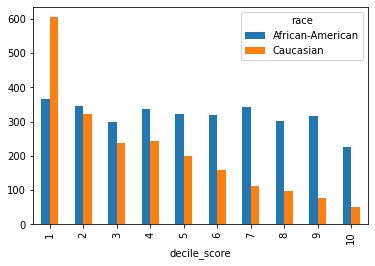
As you can observe, there is a large discrepancy. Does this change when we condition on other variables?
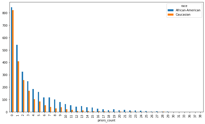
Look at how priors are distributed. Follow what you did above for score by race (or continue for help)
priors = df.groupby(['race','priors_count']).size().reset_index().pivot(index='priors_count',columns='race',values=0)
priors.plot(kind='bar',figsize=[12,7])
<AxesSubplot:xlabel='priors_count'>
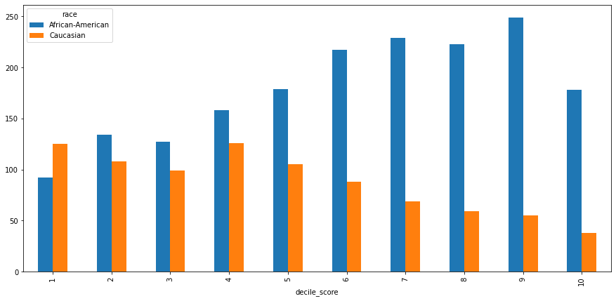
Look at how scores are distributed for those with more than two priors
(bonus) What about with less than two priors ?(you can copy or import again the above and modify it)
(bonus) Look at first time (use
priors_count) felons (c_charge_degreeofF) under 25. How is this different?
df_2priors = df.loc[df['priors_count']>=2]
score_2priors = df_2priors.groupby(['race','decile_score']).size().reset_index().pivot(
    index='decile_score',columns='race',values=0)
score_2priors.plot(kind='bar',figsize=[15,7])
<AxesSubplot:xlabel='decile_score'>
What happens when we take actual 2-year recidivism values into account? Are the predictions fair?
First, we’re going to load a different version of the data, it’s quantized. Then look at the correlation between the quantized score, the decile score and the actual recidivism.
dfQ = pd.read_csv('https://raw.githubusercontent.com/ml4sts/outreach-compas/main/data/compas_cq.csv')
Is the ground truth correlated to the high/low rating (score_text)?
# measure with high-low score
dfQ[['two_year_recid','score_text']].corr()
| two_year_recid | score_text | |
|---|---|---|
| two_year_recid | 1.000000 | 0.314698 |
| score_text | 0.314698 | 1.000000 |
Is the ground truth correlated to the decile_scorerating?
dfQ[['two_year_recid','decile_score']].corr()
| two_year_recid | decile_score | |
|---|---|---|
| two_year_recid | 1.000000 | 0.368193 |
| decile_score | 0.368193 | 1.000000 |
The correlation is not that high. How can we evaluate whether the predictions made by the COMPAS scores are fair, especially considering that they do not predict recidivism rates well?
Fairness Metrics
The question of how to determine if an algorithm is fair has seen much debate recently (see this tutorial from the Conference on Fairness, Acountability, and Transparency titled 21 Fairness Definitions and Their Politics.
And in fact some of the definitions are contradictory, and have been shown to be mutually exclusive [2,3] https://www.propublica.org/article/bias-in-criminal-risk-scores-is-mathematically-inevitable-researchers-say
Here we will cover 3 notions of fairness and present ways to measure them:
Disparate Impact 4 The 80% rule
Calibration 6
Equalized Odds 5
For the rest of our analysis we will use a binary outcome - COMPAS score <= 4 is LOW RISK, >4 is HIGH RISK.
Disparate Impact
Disparate impact is a legal concept used to describe situations when an entity such as an employer inadvertently discriminates gainst a certain protected group. This is distinct from disparate treatment where discrimination is intentional.
To demonstrate cases of disparate impact, the Equal Opportunity Commission (EEOC) proposed “rule of thumb” is known as the The 80% rule.
Feldman et al. 4 adapted a fairness metric from this principle. For our application, it states that the percent of defendants predicted to be high risk in each protected group (in this case whites and African-Americans) should be within 80% of each other.
Let’s evaluate this standard for the COMPAS data.
#  Let's measure the disparate impact according to the EEOC rule
means_score = dfQ.groupby(['score_text','race']).size().unstack().reset_index()
means_score = means_score/means_score.sum()
means_score
# split this cell for the above to print
# compute disparate impact
AA_with_high_score = means_score.loc[1,'African-American']
C_with_high_score = means_score.loc[1,'Caucasian']

C_with_high_score/AA_with_high_score
0.5745131730114521
This ratio is below .8, so there is disparate impact by this rule. (Taking the priveleged group and the undesirable outcome instead of the disadvantaged group and the favorable outcome).
What if we apply the same rule to the true two year rearrest instead of the quantized COMPAS score?
means_2yr = dfQ.groupby(['two_year_recid','race']).size().unstack()
means_2yr = means_2yr/means_2yr.sum()
means_2yr

# compute disparte impact
AA_with_high_score = means_2yr.loc[1,'African-American']
C_with_high_score = means_2yr.loc[1,'Caucasian']
C_with_high_score/AA_with_high_score
0.7471480065031378
There is a difference in re-arrest, but not as high as assigned by the COMPAS scores. This is still a disparate impact of the actual arrests (since this not necessarily accurate as a recidivism rate, but it is true rearrest).
Now let’s measure the difference in scores when we consider both the COMPAS output and true recidivism.
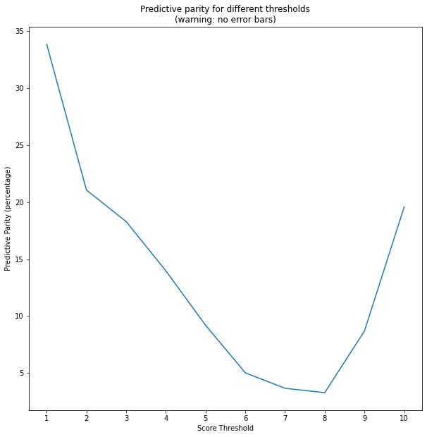
Calibration
A discussion of using calibration to verify the fairness of a model can be found in Northpoint’s (now: Equivant) response to the ProPublica article 6.
The basic idea behind calibrating a classifier is that you want the confidence of the predictor to reflect the true outcomes. So, in a well-calibrated classifier, if 100 people are assigned 90% confidence of being in the positive class, then in reality, 90 of them should actually have had a positive label.
To use calibration as a fairness metric we compare the calibration of the classifier for each group. The smaller the difference, the more fair the calssifier.
In our problem this can be expressed as given \(Y\) indicating two year recidivism, \(S_Q\) indicating score (0=low, 1=high medium), and \(R\) indicating race, we measure
where \(S\) is the original score.
We plot \(\mathsf{PP}(s) \) for \(s\) from 1 to 10. Note how predictive parity depends significantly on the threshold.
# aux function for thresh score
def threshScore(x,s):
    if x>=s:
        return 1
    else:
        return 0

ppv_values = []
dfP = dfQ[['race','two_year_recid']].copy()
for s in range(1,11):
    dfP['threshScore'] = dfQ['decile_score'].apply(lambda x: threshScore(x,s))
    dfAverage = dfP.groupby(['race','threshScore'])['two_year_recid'].mean().unstack()
    num = dfAverage.loc['African-American',1]
    denom = dfAverage.loc['Caucasian',1]
    ppv_values.append(100*(num/denom-1))


plt.figure(figsize=[10,10])
plt.plot(range(1,11),ppv_values)
plt.xticks(range(1,11))
plt.xlabel('Score Threshold')
plt.ylabel('Predictive Parity (percentage)')
plt.title('Predictive parity for different thresholds\n(warning: no error bars)')
Text(0.5, 1.0, 'Predictive parity for different thresholds\n(warning: no error bars)')
Equalized Odds
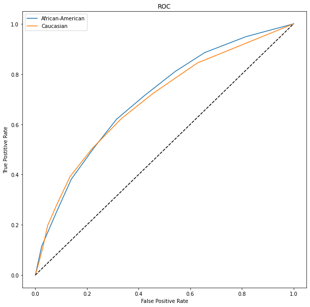
The last fairness metric we consider is based on the difference in error rates between groups. Hardt et al. 5 propose to look at the difference in the true positive and false positive rates for each group. This aligns with the analysis performed by Propublica. We can examine these values looking at is the ROC for each group. We normalize the score between 0 and 1. The ROC thresholds produced by scikitlearn are the same.
Discuss these results and copmare how these metrics show that there is (or is not) a disparity.
# normalize decile score
max_score = dfQ['decile_score'].max()
min_score = dfQ['decile_score'].min()
dfQ['norm_score'] = (dfQ['decile_score']-min_score)/(max_score-min_score)


plt.figure(figsize=[10,10])
#plot ROC curve for African-Americans
y = dfQ.loc[dfQ['race']=='African-American',['two_year_recid','norm_score']].values
fpr1,tpr1,thresh1 = roc_curve(y_true = y[:,0],y_score=y[:,1])
plt.plot(fpr1,tpr1)

#plot ROC curve for Caucasian
y = dfQ.loc[dfQ['race']=='Caucasian',['two_year_recid','norm_score']].values
fpr2,tpr2,thresh2 = roc_curve(y_true = y[:,0],y_score=y[:,1])
plt.plot(fpr2,tpr2)
l = np.linspace(0,1,10)
plt.plot(l,l,'k--')

plt.xlabel('False Positive Rate')
plt.ylabel('True Postitive Rate')
plt.title('ROC')
plt.legend(['African-American','Caucasian'])
<matplotlib.legend.Legend at 0x7f228d098ed0>
Extension: CORELS
COPMAS has also been criticized for being a generally opaque system. Some machine learning models are easier to understand than others, for example a rule list is easy to understand. The CORELS system learns a rule list from the ProPublica data and reports similar accuracy.
if ({Prior-Crimes>3}) then ({label=1})
else if ({Age=18-22}) then ({label=1})
else ({label=0})
Let’s investigate how the rule learned by CORELS compares.
Write a function that takes one row of the data frame and computes the corels function
Use
df.applyto apply your function and add a column to the data frame with the corels scoreEvaluate the CORELS prediction with respect to accuracy, and fairness following the above
def corels_rule(row):
    if row['priors_count'] > 3:
        return True
    elif row['age'] == 'Less than 25':
        return True
    else:
        return False

df['corels'] = df.apply(corels_rule,axis=1)

#  Let's measure the disparate impact according to the EEOC rule
means_corel = df.groupby(['corels','race']).size().unstack().reset_index()
means_corel = means_corel/means_corel.sum()
means_corel
| race | corels | African-American | Caucasian |
|---|---|---|---|
| 0 | 0.0 | 0.617638 | 0.788873 |
| 1 | 1.0 | 0.382362 | 0.211127 |